CORRECTION
Shooting 200 speed film at 50 would be 2 stops overexposed. Setting the camera at 75 would be 1 1/2 stops overexposed. However, I did not shoot at 50. The clip shown was recorded purely for demonstration and I moved the ASA dial back to 200 after recording. I actually overexposed by using the F3’s exposure compensation dial which I did set to the equivalent of 1 1/2 stops over so the results seen in this video do align with what I was saying.
If you're considering buying any of the products mentioned, please support my work by using the links below.
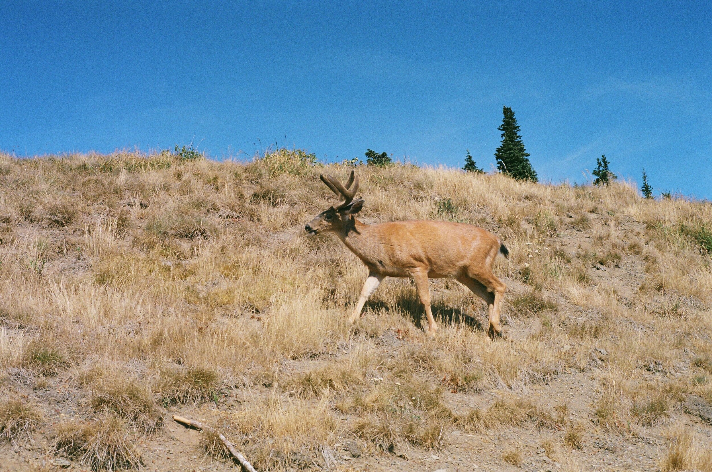
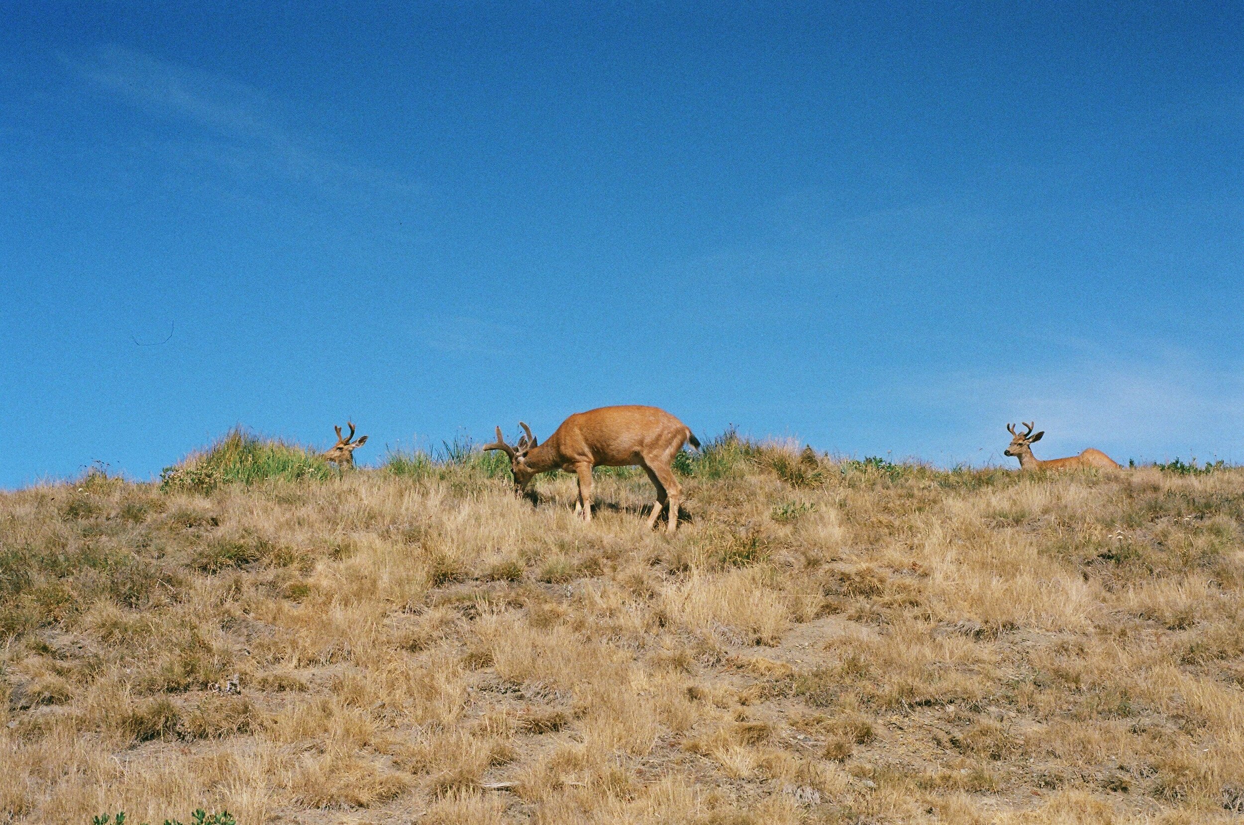
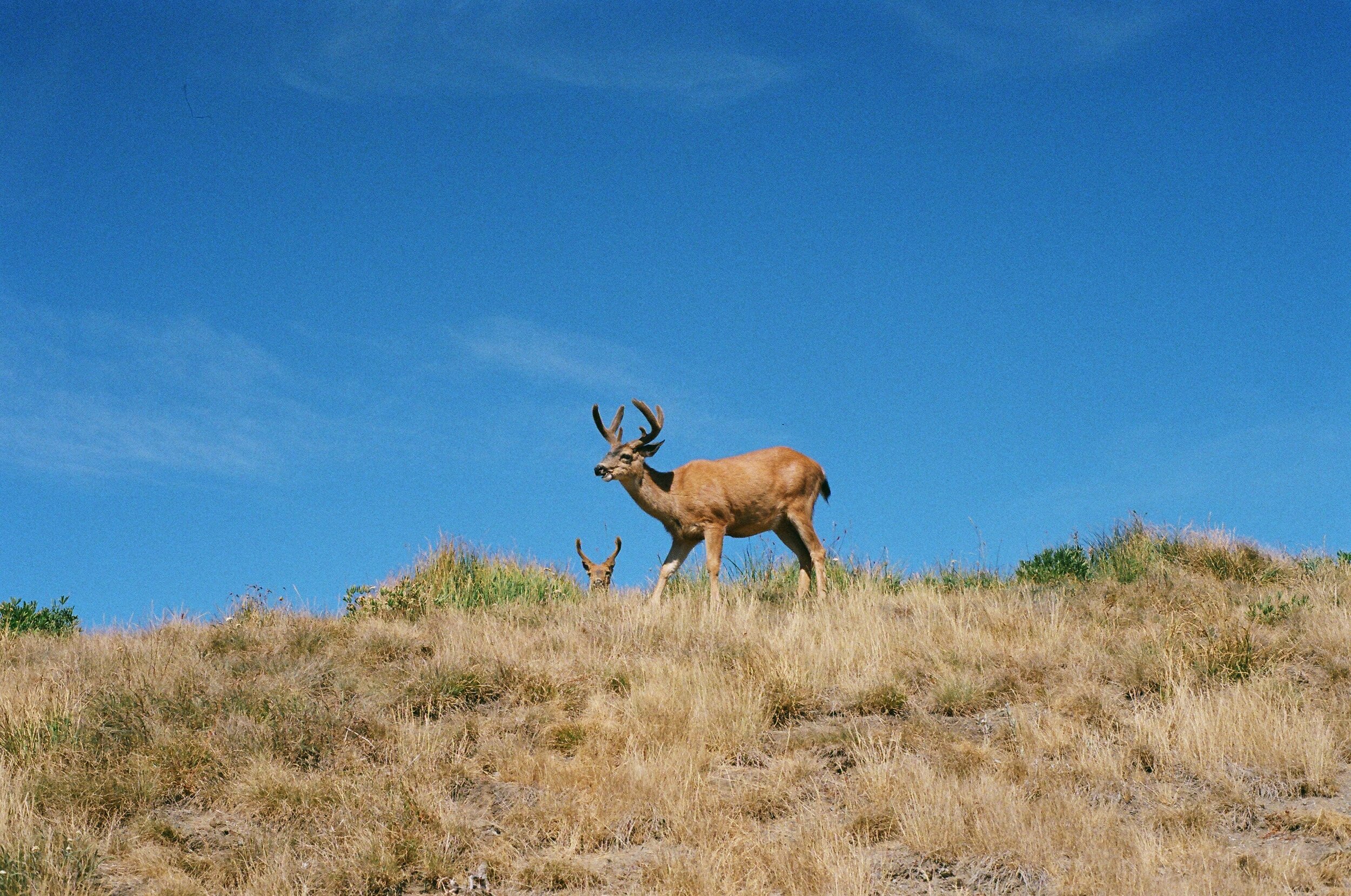
Fujifilm Fujicolor C200 https://amzn.to/3NXL3f4
Nikon F3 https://amzn.to/3KxGlm3
Want to support my work?
Consider visiting the shop and buying "Absolutely Nothing"
https://www.HaiHoangTran.com/shop/absolutely-nothing
or
Become a YouTube member!
https://www.youtube.com/channel/UCLUO-2ltlWfydRZ7pRRnXkw/join
Become a Patron!
https://www.patreon.com/HaiHoangTran
or
Buy some official merch!
https://www.youtube.com/haitran/store
PayPal
https://www.PayPal.me/HaiHoangTran
or
Just shop on Amazon via this link!
https://amzn.to/2FgsDnG